ACRES is a Singapore-based animal protection organisation that advocates for animal rights and the end of animal cruelty.
- Role School Project
- Timeline 3 Weeks
- Tools Figma, Webflow
Project Background
My classmates and I were assigned to redesign a non-profit organisation’s website, and we chose ACRES as we felt that despite its impactful mission, the organisation’s website lacks the dynamism and engagement needed to stand out in today’s digital landscape.
Main Responsibilities
We redesigned ACRES’s homepage to better highlight its mission and wildlife rescue and rehabilitation effort while making it easier for visitors to get involved. Our approach focuses on improving the user interface and enhancing the site’s visual hierarchy and intuitiveness.
Raising awareness and action for Singapore’s hidden wildlife through immersive and compassionate design.
Confusing User Experience
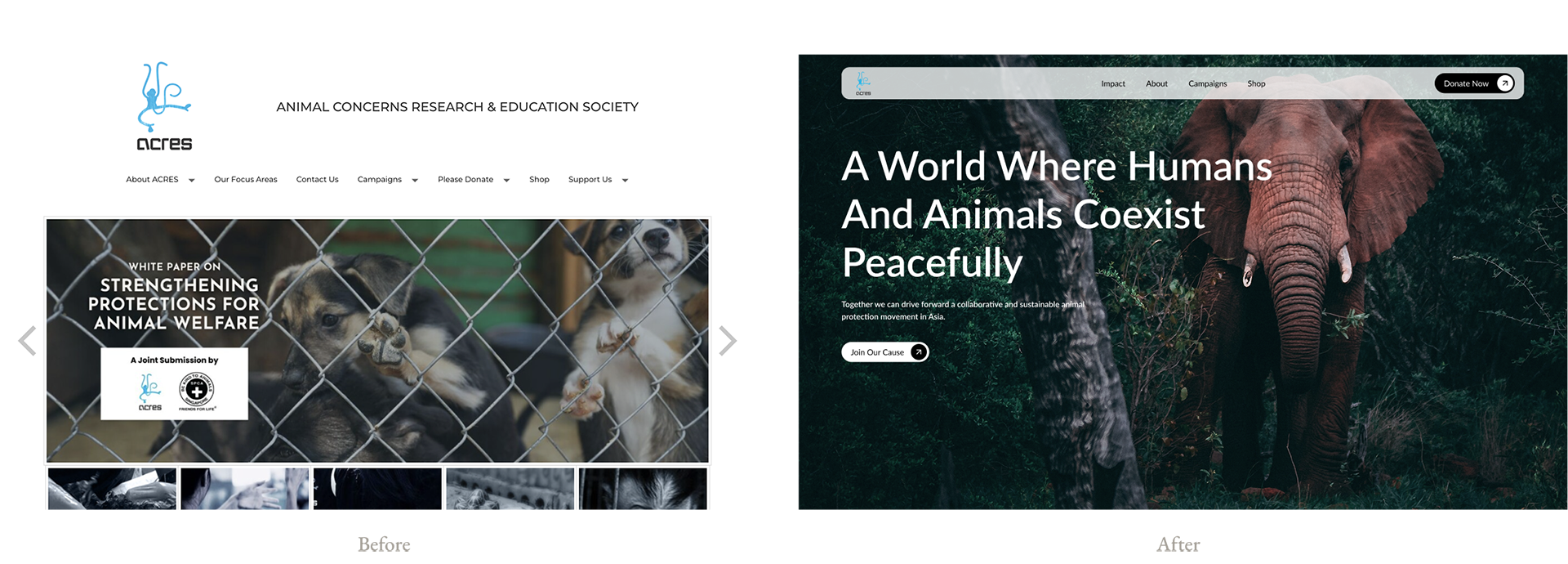
The current webpage lacks a clear focus and hierarchy, making it difficult for visitors to understand the organisation’s purpose. Key issues include an unclear mission statement, absence of strong calls-to-action like a “Donate” button, excessive text with poor readability, and dull imagery that fails to evoke emotional engagement. Overall, the design does not effectively communicate impact or inspire user participation.
We noticed that other non-profit sites like World Wildlife Fund and Habitat for Humanity display a clear call to action and meaningful imagery that clearly shows the organisation’s purpose. This is a huge contrast to ACRES current homepage and we were inspired to improve its visual storytelling and user experience
Translating Insights Into Design
During ideation, we focused on translating ACRES’ mission into a clear, emotionally engaging user journey by refining content priorities, simplifying navigation, and shaping ideas that drive action.
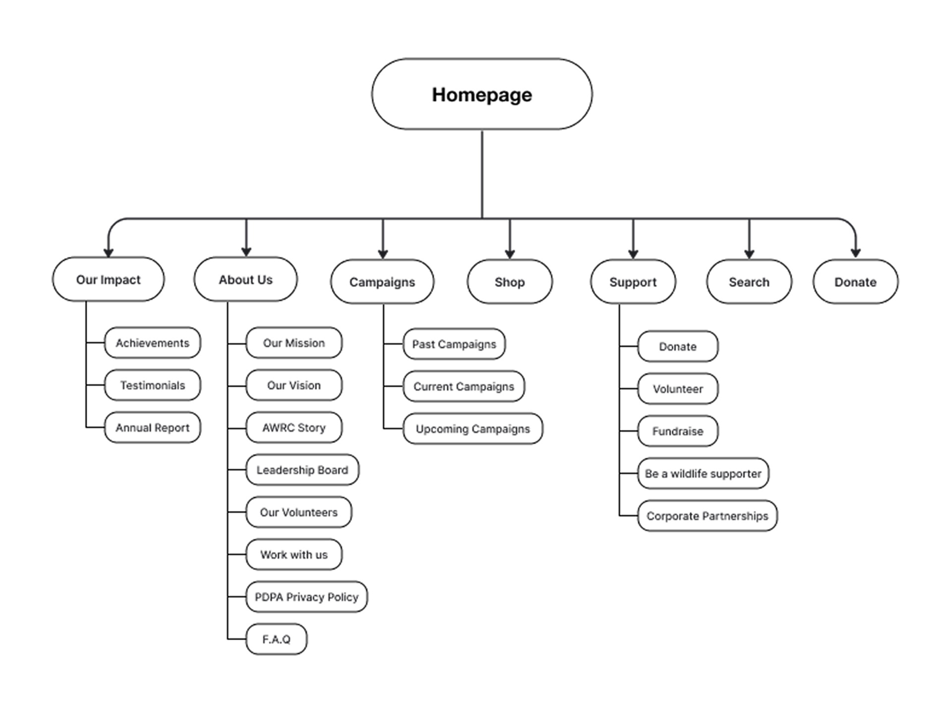
First things first, we had to fix their existing information architecture. It currently has issues with convoluted user flows and duplicated content across different pages. We decided to restructure it into clear pages and replaced redundancies with relevant information
The original hero section felt full and visually disconnected from ACRES’ mission. We replaced it with a bold, clear imagery and a concise, inspiring message that highlights coexistence between humans and animals, supported by a clear call-to-action.
The current content structure in Acres feel like a long essay, the dense paragraph texts and lack of engaging UI makes it painful to read. We redesigned it into a clean, modular layout that creates a visual balance, which makes the organisation’s work more digestible and engaging for visitors.